Tina Worboys | Feb 18, 2024
But making them work takes closer investigation and really seeing, not just looking. What exactly is that colour? Where does it fall in the colour wheel? Is it a pure ‘colour’ or is there something more in the mix? A single petal can hold a multitude of colour stories.
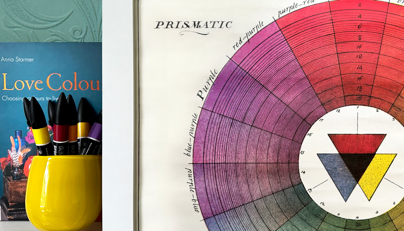
Colour experts breakdown the spectrum into defined groups. These terms help us understand what we’re really seeing. Colour is simply the blanket term for everything our eyes pick up . Hue is pure pigment, tints are hues plus white, tones are hues plus grey and shades are hues plus black. As well as sounding like a colour connoisseur, knowing your tones from your tints will help you curate what comes next.
Colour can have huge effects on our mood and ultimately how we go about our day and interact with others. Imagine spending hours in a black room versus a vibrant yellow space, you’re going to feel different (I personally love a black room, but I know I’ll feel very different walking out of each one). Throughout the day micro hits of colour are having effects.
Biophilic designers recognize this, and artfully play with these triggers. The simplest simulation of nature, green, has been proven to reduce stress, foster a sense of calm and even promote creativity. All that from a tin of paint. Such a primal response further highlighting our profound connection to the natural world.
Our eyes only see part of this colourful picture though. At both ends of the rainbow are ‘colours’ we humans completely miss. That vibrant red poppy, such a magnet for bees, is glowing ultraviolet to them. Bees can‘t even see red, their eyesight lives purely in the blues, greens and purples. At the other end of the scale infrared waves are picked up by many cold blooded creatures from fish to snakes.
Really understanding colour can help us with all design projects, not just in the garden. Rumour has it that the beautiful turquoise-blue-green of Heinz baked beans was chosen as it’s the exact opposite in the colour wheel to the orange of the famous contents. Resulting in a striking but harmonious piece of iconic design.
We often hear of ‘brave colour choices’. Brave! Like we’re warriors gearing up for battle. Really there’s nothing to fear here. It’s only colour! Sure certain colours are known to evoke certain responses, but trust your own inner barometer. Listen to your gut, follow your instincts and allow your personality to shine. By understanding what you’re really seeing, using the simple colour wheel rules of opposites attract and friendly neighbours, you can’t go far wrong. In fact wrong probably doesn’t even exist! Once you know the rules you can break them with panache, clashing colours to your heart’s content. Be bold, no need to be brave. If it lifts your heart, go for it!
The incomparable Iris Apfel said “...creativity and colour matter”, both have the power to make you feel great. There’s a world of colour to explore and experiment with, so as Iris says ‘What makes you happy?
Do you know someone who needs a little encouragement to embrace their colour journey? Why not share this post and help them find their happy?
